| Map
> Problem Definition > Data
Preparation > Data Exploration
> Modeling > Evaluation > Deployment |
|
|
|
|
|
|
Model Evaluation -
Classification
|
|
|
|
|
|
Confusion Matrix
|
|
|
|
A confusion matrix shows the number of correct and incorrect predictions made by
the classification model compared to the actual outcomes (target value) in the data. The matrix is
NxN, where
N is the number of target values (classes). Performance of such models is commonly evaluated using the data in the matrix. The following table displays a 2x2 confusion matrix for two classes
(Positive and Negative). |
|
|
| |
|
|
| Confusion Matrix |
Target |
|
| Positive |
Negative |
| Model |
Positive |
a |
b |
Positive Predictive Value |
a/(a+b) |
| Negative |
c |
d |
Negative Predictive Value |
d/(c+d) |
| |
Sensitivity |
Specificity |
Accuracy = (a+d)/(a+b+c+d) |
| a/(a+c) |
d/(b+d) |
|
|
|
| |
|
|
- Accuracy : the proportion of the total number of predictions that were correct.
- Positive Predictive Value or Precision
: the proportion of positive cases that were correctly identified.
- Negative Predictive Value : the proportion of
negative cases that were correctly identified.
- Sensitivity or Recall : the proportion of actual
positive cases which are correctly identified.
- Specificity : the proportion of actual
negative cases which are correctly identified.
|
|
|
| Example: |
|
|
| Confusion Matrix |
Target |
|
| Positive |
Negative |
| Model |
Positive |
70 |
20 |
Positive Predictive Value |
0.78 |
| Negative |
30 |
80 |
Negative Predictive Value |
0.73 |
| |
Sensitivity |
Specificity |
Accuracy = 0.75 |
| 0.70 |
0.80 |
|
|
|
| |
|
|
| |
|
|
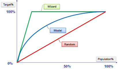
Gain and Lift Charts
|
|
|
| Gain or lift is a measure of the effectiveness of a
classification model calculated as the ratio between the results obtained with and without the model.
Gain and lift charts are visual aids for evaluating performance of
classification models. However, in contrast to the confusion matrix that
evaluates models on the whole population gain or lift chart evaluates
model performance in a portion of the population. |
|
|
| |
|
|
|
|
|
|
| |
|
|
| Example: |
|
|
|
|
|
|
|

|
|
|
| |
|
|
|
Gain Chart |
|
|
|

|
|
|
| |
|
|
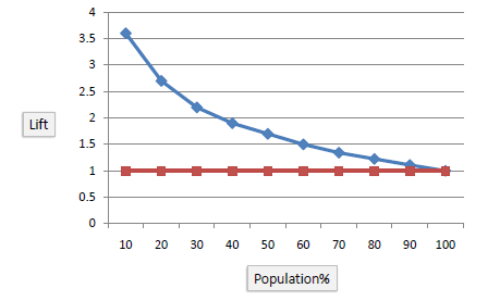
| Lift Chart |
|
|
|
The lift chart shows how much more likely we are to receive
positive responses than if we contact a random sample of customers. For example, by contacting only 10% of customers based on the predictive model we will reach 3 times as
many respondents, as if we use no model. |
|
|
|
|
|
|
| |
|
|
| |
|
|
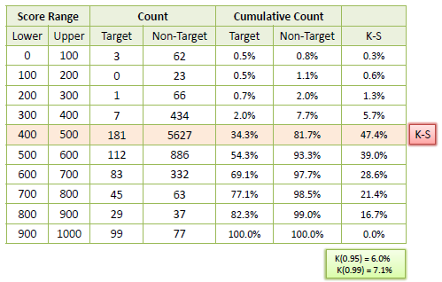
K-S Chart
|
|
|
| K-S or Kolmogorov-Smirnov chart
measures performance of classification models. More accurately, K-S is a measure of the degree of
separation between the positive and negative distributions. The K-S is 100
if the scores partition the population into
two separate groups in which one group contains all the positives and the other all the
negatives. On the other hand, If the model cannot differentiate between
positives and negatives, then it is as if the model selects cases randomly from the population. The K-S would be 0.
In most classification models the K-S will fall between 0 and 100, and that the higher the value the better the
model is at separating the positive from negative cases. |
|
|
| |
|
|
| Example: |
|
|
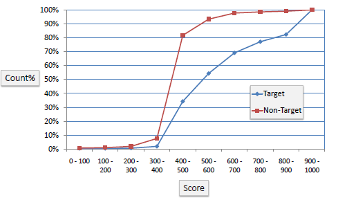
| The following example shows the results
from a classification model. The model assigns a score between 0-1000 to
each positive (Target) and negative (Non-Target) outcome. |
|
|
|
|
|
|
|
|
|
|
|
|
|
| |
|
|
| |
|
|
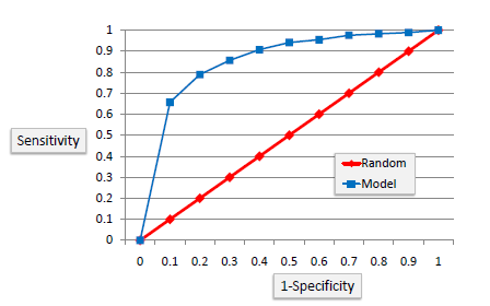
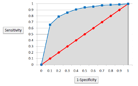
ROC Chart
|
|
|
|
The ROC chart is similar to the gain or lift charts
in that they provide a means of comparison between classification models. The ROC
chart shows false positive rate (1-specificity) on X-axis, the probability of
target=1 when its true value is 0, against true positive rate (sensitivity)
on Y-axis, the probability of target=1 when its true value is 1. Ideally, the curve will climb quickly toward the top-left meaning the
model correctly predicted the cases. The diagonal red line is for a random
model (ROC101). |
|
|
|
|
|
|
| |
|
|
| Area Under the Curve (AUC) |
|
|
| Area under ROC curve is often used as a measure of quality of
the classification models. A random classifier has an area under the curve of 0.5,
while AUC for a perfect classifier is equal to 1. In practice, most of the
classification models have an AUC between 0.5 and 1. |
|
|
|
|
|
|
| An area under the ROC curve of 0.8, for example, means that a randomly selected case from the group with
the target equals 1 has a score larger than that for a randomly chosen case from the group
with the target equals 0 in 80% of the time. When a classifier cannot distinguish between the two
groups, the area will be equal to 0.5 (the ROC curve will coincide with the diagonal). When there is a perfect separation of
the two groups, i.e., no overlapping of the distributions, the area under the ROC curve
reaches to 1 (the ROC curve will reach the upper left corner of the plot).
|
|
|
| |
|
|
|
|
|
|
|
|
|
|
|
|
|
|